
Responsive design has become a buzzword in web development, but it’s far more than a trend. In 2025, with digital engagement surging and user expectations rising, a responsive website design isn’t optional—it’s essential. Businesses that prioritize adaptable and user-centric designs see higher engagement, better rankings through SEO optimization services, and more conversions.
What Is Responsive Web Design?
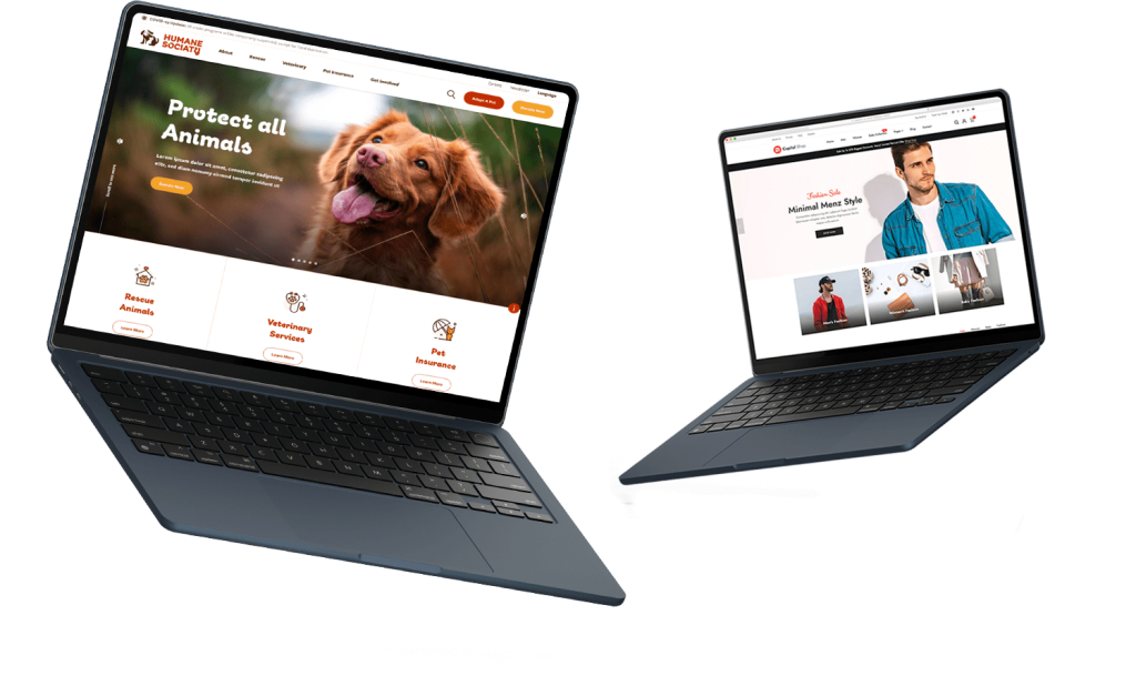
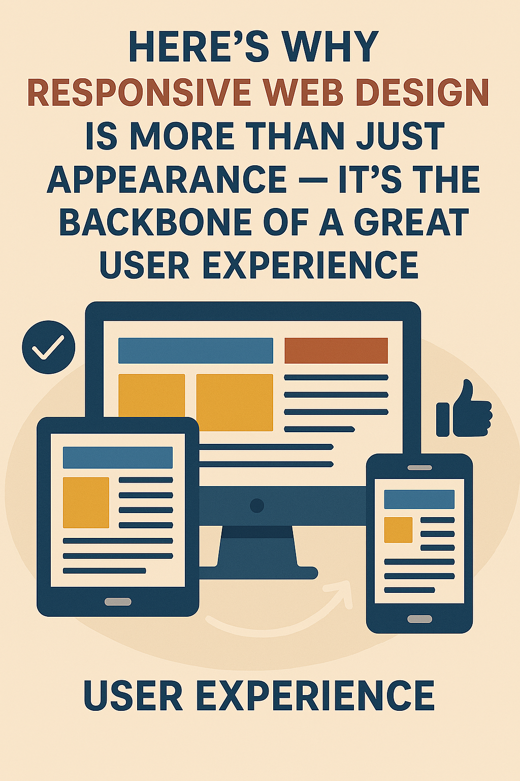
Responsive website design is a result-driven design approach where websites adapt fluidly to different screen sizes, resolutions, and orientations. Whether it’s a desktop, tablet, or smartphone, responsive sites ensure a consistent and optimized user experience.
Rather than building separate websites for diversified devices, responsive design uses CSS media queries, fluid grids, and flexible images to create one website that responds to the environment in which it’s viewed. This flexibility makes development and maintenance more efficient in the long run.
The SEO Benefits of Going Responsive
Enhanced Mobile-Friendliness
Google prioritizes mobile-first indexing. This means that Google predominantly uses the mobile version of content for indexing and ranking. If your site isn’t mobile-friendly, it’s already at a ranking disadvantage.
Lower Bounce Rates
When users opens a website easily on any device, they’re more likely to stay. This lowers bounce rates, an important factor in search engine rankings. If users leave immediately because your site looks broken or hard to use, Google takes note.
Improved Page Speed
Responsive design encourages better optimization of images and elements for all devices, contributing to faster load times—a critical SEO optimization services factor. Fast websites keep users engaged and drive better engagement metrics, which Google rewards.
How Responsive Design Enhances UX
Seamless Navigation
Users expect websites to function intuitively across devices. Responsive layouts ensure navigation menus, buttons, and CTAs are accessible and easy to use. A frustrating mobile experience can be a deal-breaker for visitors.
Consistent Branding
Maintaining visual consistency across platforms builds brand trust. Responsive design ensures that fonts, colors, and visuals remain uniform, reinforcing your brand identity whether viewed on a smartphone or widescreen monitor.
Accessibility and Inclusivity
A responsive site can be more accessible for users with disabilities, contributing to improved usability and broader reach.
Real-World Example: Case Study of Improved Metrics
A recent Speed Dot 360 project for a mid-sized ecommerce client saw a 35% increase in mobile conversions and a 40% decrease in bounce rate after implementing a fully responsive website design. Additionally, the client’s Google PageSpeed score jumped by 25 points within three weeks.
“We never realized how many potential customers we were losing on mobile until we upgraded to a responsive layout. The improvement was instant.” — Client Testimonial
Key Elements of a Responsive Website
- Flexible Grids and Layouts
- Responsive Images
- Media Queries
- Touch-Friendly Interactions
- Mobile-First Testing Environments
The Role of a UI/UX Design Agency
Professional UI/UX design agency teams bring deep knowledge of user behavior, enabling data-driven design decisions. At Speed Dot 360, we integrate:
- Real-time analytics
- A/B testing
- Accessibility audits
- Heatmaps and behavior analysis
All these help us create experiences that not only look great but convert better.
Emerging Trends in Responsive Design (2025 and Beyond)
- AI-Powered Personalization
- Voice Interface Compatibility
- Augmented Reality Elements
- Dark Mode Optimization
Industry Perspectives: What Experts Are Saying
According to a 2024 report by Adobe, 73% of users said they are more likely to return to a mobile-friendly website design. Google’s own research shows that 61% of users are unlikely to return to a mobile site they had trouble accessing.
“Responsive design is not just a technical requirement—it’s a brand’s handshake with its users.” — UX Matters Magazine
Internal Linking Strategy
Responsive website design pages should include smart internal links to:
- Mobile app development
- Speed optimization services
- UI/UX case studies
This boosts SEO and enhances the user journey.
Final Thoughts
Responsive design is no longer just about accommodating mobile users—it’s about delivering seamless, fast, and enjoyable digital experiences across the board. It impacts SEO, brand perception, conversions, and user trust.
If your site isn’t responsive in 2025, you’re not just behind—you’re invisible.
Partner with Speed Dot 360 to audit, upgrade, and future-proof your website. Because first impressions now happen in the palm of your customer’s hand.