
In today’s digital-first world, a website that looks good but doesn’t perform is a liability. Many businesses invest in sleek designs or flashy visuals but forget about one of the most crucial elements of a high-performing website—its structure.
If your content is hard to find, navigation feels clunky, or pages are buried beneath layers of poor hierarchy, both your visitors and search engines will leave. This is where Speed Dot 360 helps transform confusion into clarity. Backed by years of experience in custom web development and responsive website design, we’ve developed a tried-and-true method to structure websites for both humans and algorithms.
In this step-by-step guide, we walk you through the foundational process of building a site that is intuitive, scalable, SEO-friendly, and designed with the user in mind.
Step 1: Begin With Business and User Alignment
Before a single wireframe is built or a sitemap is drawn, we start by understanding two key things: your business goals and your audience’s expectations. It sounds basic, but it’s often overlooked.
Are you aiming to generate leads, showcase a portfolio, or build an ecommerce platform? Knowing this determines how your homepage, menus, and landing pages are prioritized.
Likewise, your audience’s journey on the site should feel logical and seamless. A visitor looking for pricing shouldn’t have to dig through five pages. That’s why our process at Speed Dot 360 always starts with user-first thinking—laying the foundation for a structure that feels natural from the first click.
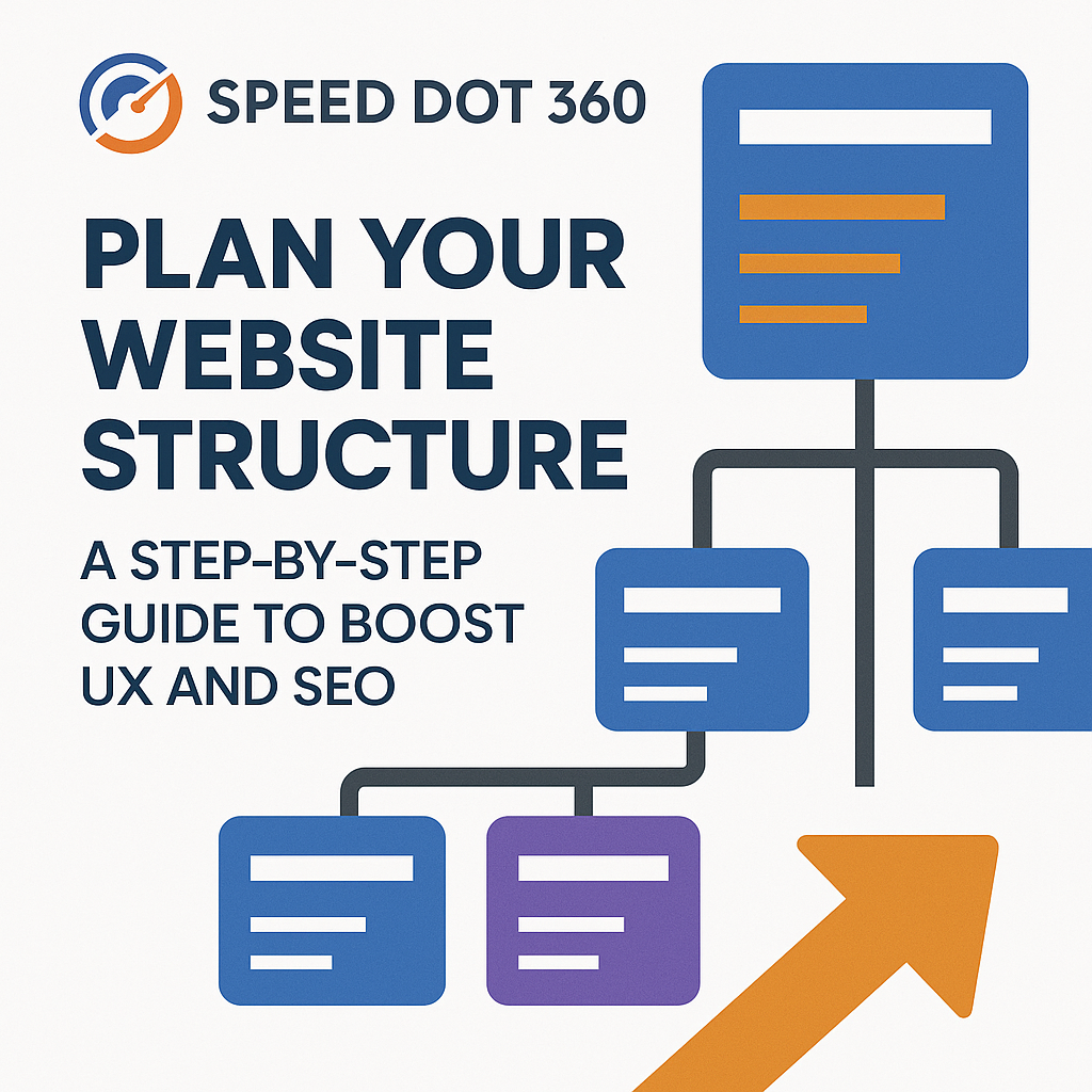
Step 2: Design the Hierarchy Intentionally
Think of your site as a pyramid. At the top is your homepage, and beneath it are the core content categories, followed by subcategories and supporting pages. But a pyramid isn’t just about shape—it’s about clarity.
Search engines, especially Google, prefer flat site structures where most pages are accessible within a few clicks. Our team helps streamline your architecture so your most important content is never too far away—improving both crawlability and user experience.
Rather than overcomplicating with endless submenus and deep layers, we organize your content into clear categories that are easy to navigate, even on a mobile device—thanks to our focus on mobile-friendly website design.
Step 3: Navigation That Guides and Converts
Navigation is more than just a menu. It’s your website’s GPS. Poor navigation is one of the fastest ways to lose a visitor, and it’s a common cause of high bounce rates.
We build navigation systems that align with your sitemap. Whether it’s a top-level nav bar, a sticky menu, or contextual internal links within the content, our focus is on guiding users to the right destination with minimal friction.
Instead of relying on dropdown after dropdown, we focus on clarity: simplified labels, prioritized links, and smooth mobile interactions—key ingredients in responsive website design that keep visitors engaged on every screen.
Step 4: URLs That Make Sense (To Users and Search Engines)
Your website’s URLs are its street addresses. A clean, keyword-friendly URL structure makes a huge difference in SEO rankings and user trust.
Rather than auto-generated slugs like /page?id=928, we implement semantic URLs such as /services/custom-web-development. Not only are they effortless for search engines to crawl, but they’re also more intuitive for users to remember and share.
At Speed Dot 360, our developers integrate this during the build phase, ensuring every URL works with your content hierarchy, not against it.
Step 5: Build for Mobile From Day One
With mobile traffic making up over 60% of total web visits globally, ignoring the mobile experience isn’t an option—it’s a mistake. At Speed Dot 360, mobile-friendly website design is the default, not the afterthought.
Your site structure must hold up just as well on a smartphone as it does on a widescreen monitor. That means reducing menu clutter, optimizing tap areas, streamlining loading times, and prioritizing thumb-friendly interactions.
Whether your users are browsing on the go or searching for your contact info before booking a service, our team ensures your mobile structure delivers a consistently excellent experience.
Step 6: Connect Your Content Strategically
Internal linking is the secret weapon of site architecture. It’s what keeps users exploring your site and allows Google’s bots to understand the relationship between your pages.
Rather than stuffing every blog post with random links, we craft strategic pathways between related content—especially between cornerstone pages and supporting blog entries. This not only helps with SEO but encourages deeper engagement from visitors who want more.
When paired with a strong content plan, this structure also helps build authority around topics relevant to your niche.
Step 7: Use Real-Time Data to Refine the Flow
A well-structured website doesn’t just happen once and stay that way forever—it evolves.
Post-launch, we use tools like Google Analytics and Hotjar to monitor how users move through your site. Where do they click? Where do they drop off? Are they reaching key conversion points?
These insights allow our team to make informed updates, test new navigation strategies, or adjust the layout for better flow. As a performance-driven UI/UX design agency, we don’t guess—we optimize based on real behavior.
Step 8: SEO-First, Always
While UX is vital, structure without SEO is like building a road with no signs.
That’s why our structures are SEO-first from the blueprint. We help ensure each page is indexed properly, structured for relevance, and designed to answer searcher intent. This includes schema markup, logical heading hierarchies, optimized category pages, and XML sitemaps that help search engines crawl effectively.
Good structure supports great SEO. It’s not just about showing up—it’s about staying visible.
Why Partner with Speed Dot 360?
Speed Dot 360 isn’t just about building websites—it’s about engineering a digital ecosystem. From smart information architecture to intuitive flow, from clean code to conversion-ready layouts, we blend custom web development with deep UX insight.
Whether you’re launching a new business, scaling an enterprise site, or revamping your current structure, we help you build something that grows with your goals—and your users.
Conclusion
Your website’s structure is more than a backend consideration—it’s a frontline experience that impacts your traffic, rankings, and revenue. The better your structure, the more your users will trust and engage with your brand.
Speed Dot 360 combines the power of responsive website design, clean UX principles, and scalable custom web development to help you build a digital experience that delivers on every front—from user satisfaction to SEO success.