
Plan Your Website Structure With Speed Dot 360 | A Step-by-Step Guide to Boost UX and SEO
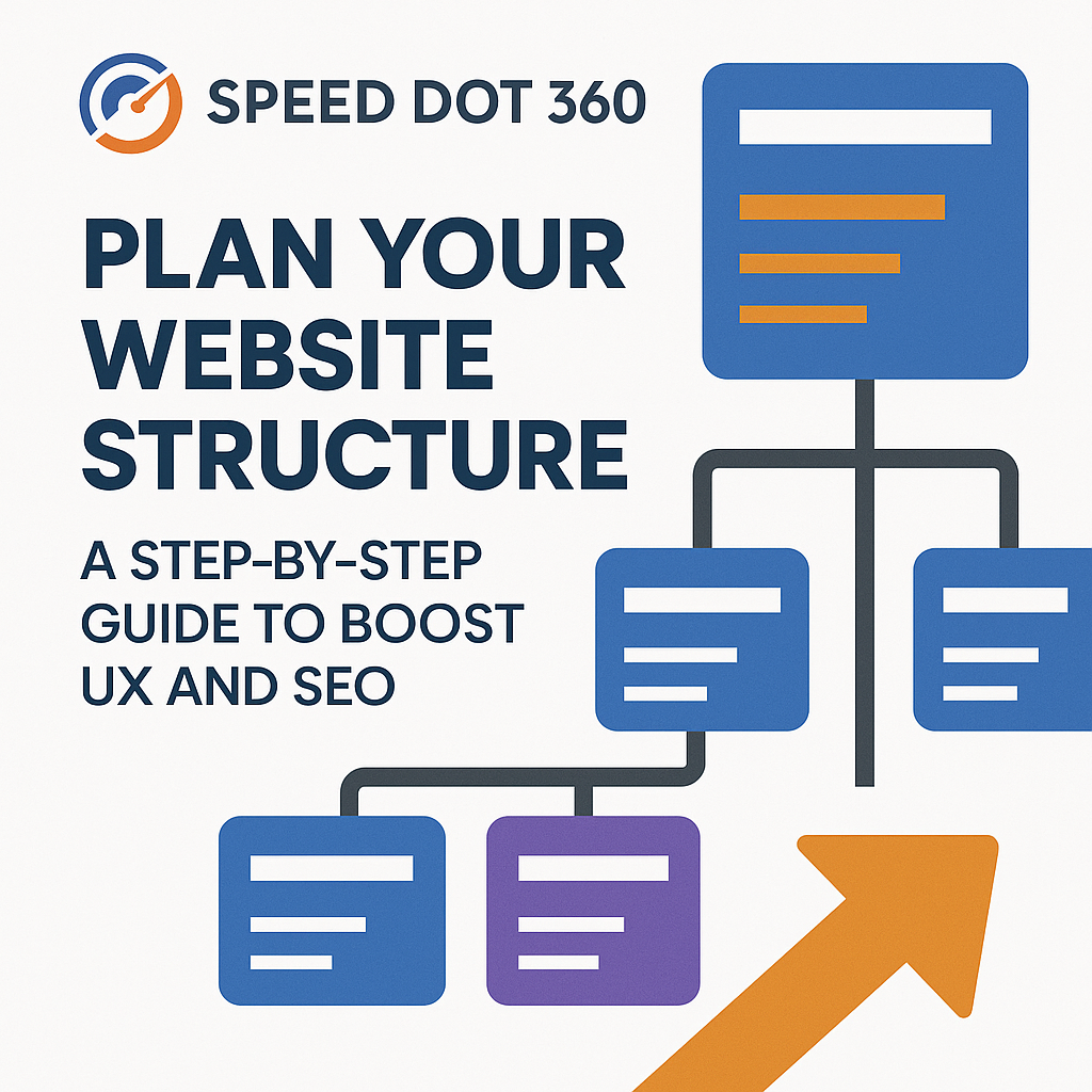
In today’s digital-first world, a website that looks good but doesn’t perform is a liability. Many businesses invest in sleek designs or flashy visuals but forget about one of the most crucial elements of a high-performing website—its structure. If your content is hard to find, navigation feels clunky, or pages are buried beneath layers of poor hierarchy, both your visitors and search engines will leave. This is where Speed Dot 360 helps transform confusion into clarity. Backed by years of experience in custom web development and responsive website design, we’ve developed a tried-and-true method to structure websites for both humans and algorithms. In this step-by-step guide, we walk you through the foundational process of building a site that is intuitive, scalable, SEO-friendly, and designed with the user in mind. Step 1: Begin With Business and User Alignment Before a single wireframe is built or a sitemap is drawn, we start by understanding two key things: your business goals and your audience’s expectations. It sounds basic, but it’s often overlooked. Are you aiming to generate leads, showcase a portfolio, or build an ecommerce platform? Knowing this determines how your homepage, menus, and landing pages are prioritized. Likewise, your audience’s journey on the site should feel logical and seamless. A visitor looking for pricing shouldn’t have to dig through five pages. That’s why our process at Speed Dot 360 always starts with user-first thinking—laying the foundation for a structure that feels natural from the first click. Step 2: Design the Hierarchy Intentionally Think of your site as a pyramid. At the top is your homepage, and beneath it are the core content categories, followed by subcategories and supporting pages. But a pyramid isn’t just about shape—it’s about clarity. Search engines, especially Google, prefer flat site structures where most pages are accessible within a few clicks. Our team helps streamline your architecture so your most important content is never too far away—improving both crawlability and user experience. Rather than overcomplicating with endless submenus and deep layers, we organize your content into clear categories that are easy to navigate, even on a mobile device—thanks to our focus on mobile-friendly website design. Step 3: Navigation That Guides and Converts Navigation is more than just a menu. It’s your website’s GPS. Poor navigation is one of the fastest ways to lose a visitor, and it’s a common cause of high bounce rates. We build navigation systems that align with your sitemap. Whether it’s a top-level nav bar, a sticky menu, or contextual internal links within the content, our focus is on guiding users to the right destination with minimal friction. Instead of relying on dropdown after dropdown, we focus on clarity: simplified labels, prioritized links, and smooth mobile interactions—key ingredients in responsive website design that keep visitors engaged on every screen. Step 4: URLs That Make Sense (To Users and Search Engines) Your website’s URLs are its street addresses. A clean, keyword-friendly URL structure makes a huge difference in SEO rankings and user trust. Rather than auto-generated slugs like /page?id=928, we implement semantic URLs such as /services/custom-web-development. Not only are they effortless for search engines to crawl, but they’re also more intuitive for users to remember and share. At Speed Dot 360, our developers integrate this during the build phase, ensuring every URL works with your content hierarchy, not against it. Step 5: Build for Mobile From Day One With mobile traffic making up over 60% of total web visits globally, ignoring the mobile experience isn’t an option—it’s a mistake. At Speed Dot 360, mobile-friendly website design is the default, not the afterthought. Your site structure must hold up just as well on a smartphone as it does on a widescreen monitor. That means reducing menu clutter, optimizing tap areas, streamlining loading times, and prioritizing thumb-friendly interactions. Whether your users are browsing on the go or searching for your contact info before booking a service, our team ensures your mobile structure delivers a consistently excellent experience. Step 6: Connect Your Content Strategically Internal linking is the secret weapon of site architecture. It’s what keeps users exploring your site and allows Google’s bots to understand the relationship between your pages. Rather than stuffing every blog post with random links, we craft strategic pathways between related content—especially between cornerstone pages and supporting blog entries. This not only helps with SEO but encourages deeper engagement from visitors who want more. When paired with a strong content plan, this structure also helps build authority around topics relevant to your niche. Step 7: Use Real-Time Data to Refine the Flow A well-structured website doesn’t just happen once and stay that way forever—it evolves. Post-launch, we use tools like Google Analytics and Hotjar to monitor how users move through your site. Where do they click? Where do they drop off? Are they reaching key conversion points? These insights allow our team to make informed updates, test new navigation strategies, or adjust the layout for better flow. As a performance-driven UI/UX design agency, we don’t guess—we optimize based on real behavior. Step 8: SEO-First, Always While UX is vital, structure without SEO is like building a road with no signs. That’s why our structures are SEO-first from the blueprint. We help ensure each page is indexed properly, structured for relevance, and designed to answer searcher intent. This includes schema markup, logical heading hierarchies, optimized category pages, and XML sitemaps that help search engines crawl effectively. Good structure supports great SEO. It’s not just about showing up—it’s about staying visible. Why Partner with Speed Dot 360? Speed Dot 360 isn’t just about building websites—it’s about engineering a digital ecosystem. From smart information architecture to intuitive flow, from clean code to conversion-ready layouts, we blend custom web development with deep UX insight. Whether you’re launching a new business, scaling an enterprise site, or revamping your current structure, we help you build something that grows with your goals—and your users. Conclusion Your website’s structure is more than a backend consideration—it’s a frontline experience that impacts
UI/UX Trends That Are Already Shaping the Web in 2025
As we step into 2025, UI/UX design agency experts are witnessing rapid transformations in digital experiences. With the growing importance of user-centric designs, brands are focusing on creating intuitive, immersive, and aesthetically appealing interfaces. The integration of AI, immersive technologies, and personalization is redefining how users interact with websites and applications. In this blog, we explore the top UI/UX trends that are already shaping the web in 2025 and how they can elevate your digital presence. AI-Powered Personalization Artificial intelligence (AI) leads the charge of UI/UX innovation, allowing websites and apps to adapt to individual user behaviors. Dynamic UI Adjustments: AI-powered interfaces can modify layouts, colors, and content based on user preferences. Predictive User Experience: Machine learning anticipates user needs, offering personalized recommendations and automating interactions. Conversational AI: AI-driven chatbots and virtual assistants provide instant responses, enhancing engagement and user satisfaction. Personalization powered by AI is no longer a luxury but a necessity for businesses looking to enhance user retention. Immersive 3D and AR/VR Interfaces As hardware capabilities advance, the use of 3D elements and augmented/virtual reality (AR/VR) in UI/UX design is becoming more prevalent. Augmented Reality Shopping: E-commerce platforms integrate AR for virtual try-ons, helping customers visualize products before purchasing. 3D Web Design: Websites with interactive 3D models create engaging experiences without requiring additional applications. Virtual Reality Interfaces: Immersive VR applications enhance training simulations, real estate tours, and gaming experiences. These enhancements push digital experiences beyond static interfaces, making interactions more engaging and realistic. Dark Mode and Low-Light UI Dark mode has changed from a trend to a standard feature in modern UI/UX design. Reduces Eye Strain: Dark backgrounds reduce screen glare and improve readability in low-light environments. Enhances Aesthetics: Dark mode creates a sleek, modern appearance, making content stand out more effectively. Battery Efficiency: OLED and AMOLED screens consume less power when displaying dark themes, extending battery life for mobile users. Websites and apps are offering adaptive themes that permit users to switch between light and dark modes based on preference. Voice User Interfaces (VUI) Voice interactions are reshaping how users engage with digital platforms. Voice User Interfaces (VUI) are streamlining navigation and accessibility. Voice Search Optimization: More users rely on voice commands for search queries, making websites optimize for conversational keywords. Hands-Free Navigation: Voice commands enable touch-free interactions, enhancing accessibility. Multimodal Interfaces: Combining voice, text, and gesture controls for a more natural and intuitive experience. VUI is particularly useful in smart home devices, automotive applications, and hands-free browsing experiences. Microinteractions and Animations Subtle animations and microinteractions enhance the user experience by providing feedback and improving navigation. Button Hover Effects: Enhances engagement by visually responding to user actions. Loading Animations: Reduces perceived wait time with creative, interactive loaders. Scrolling Effects: Parallax and motion animations create depth and engagement. These small yet impactful details contribute to a more interactive and enjoyable browsing experience. Neumorphism and Soft UI Design Neumorphism is a fusion of skeuomorphism and flat design, creating soft, realistic-looking interfaces. Subtle Shadows and Highlights: Enhances depth and visual appeal. Minimalistic and Elegant Look: Focuses on simplicity while maintaining a futuristic aesthetic. User-Friendly Interaction: Buttons and elements appear pressable, improving usability. Neumorphism is gaining popularity in dashboards, mobile applications, and product landing pages. Data-driven UX and Analytics-Based Design With increased competition, businesses are leveraging data to improve user experience (UX) strategies. A/B Testing for UI Elements: Testing multiple designs to determine what works best. Heatmaps and User Behavior Analysis: Understanding user interaction patterns for better design decisions. Real-Time UX Adjustments: AI-driven platforms optimize interfaces based on real-time user actions. By utilizing analytics, brands can refine their digital experiences to maximize engagement and conversions. Hyper-Minimalism in UI As attention spans shorten, hyper-minimalism is becoming a dominant UI trend. Clutter-Free Interfaces: Eliminates unnecessary elements, focusing on essential content. Monochromatic and Pastel Color Palettes: Enhances simplicity and elegance. Bold Typography: Prioritizes readability and visual impact. Hyper-minimalism improves usability by ensuring intuitive navigation without distractions. Biometric Authentication and Enhanced Security UI Security is a growing concern, and biometric authentication is shaping UI/UX designs for better user protection. Facial Recognition and Fingerprint Scanners: Ensuring secure and seamless logins. Passwordless Authentication: Removing the need for traditional passwords with biometric security. Multi-Factor Authentication (MFA): Strengthening security layers for sensitive applications. Designing seamless yet secure authentication processes improves both UX and data protection. Sustainable and Eco-Friendly UI Design Sustainability is influencing digital design practices. Eco-friendly UI/UX trends focus on optimizing energy consumption and ethical web design. Low-Impact Color Schemes: Darker and muted tones reduce energy usage on screens. Efficient Code and Lightweight Websites: Faster-loading sites consume fewer resources. Accessibility-Focused Designs: Ensuring inclusivity for users of all abilities. Brands adopting sustainable UI practices demonstrate responsibility while enhancing digital performance. Why Choose Speed Dot 360 for UI/UX Design Services? At Speed Dot 360, we are a leading UI/UX design agency committed to crafting modern, engaging, and user-friendly digital experiences. Our proficiency ensures that your business stays ahead with the latest design trends, offering: AI-driven UI enhancements for personalized experiences. Immersive 3D and AR-based interfaces that engage users. Minimalist and accessibility-focused designs for seamless navigation. Data-backed design optimizations for maximum user retention. Partner with us to future-proof your digital presence with cutting-edge UI/UX solutions. Conclusion The UI/UX trends of 2025 are already shaping the digital landscape, emphasizing personalization, accessibility, and immersive experiences. From AI-driven interfaces to sustainable design, businesses must adapt to these trends to stay competitive. As a trusted UI/UX design agency, Speed Dot 360 helps businesses integrate these innovations into their websites and applications. Whether you’re revamping your digital platform or starting fresh, our experts ensure that your UI/UX strategy is future-proof and engaging. Stay ahead of the curve—contact Speed Dot 360 today to elevate your digital experience! Frequently Asked Questions (FAQs) What are the biggest UI/UX trends in 2025? The biggest UI/UX trends in 2025 include AI-powered personalization, immersive 3D and AR/VR interfaces, dark mode adaptation, voice user interfaces (VUI), and hyper-minimalistic design. These trends focus on creating seamless, user-friendly, and visually engaging digital experiences. How